 1. What went well:
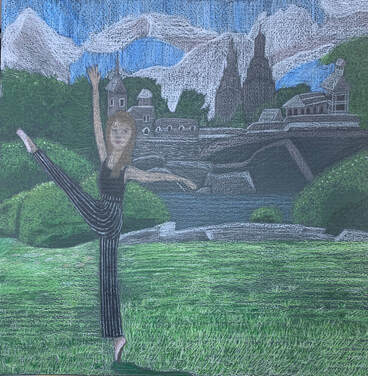
I think I did a pretty good job drawing the grass. It seems to have a fair amount of texture in it, and it looks kind of realistic. I also like how the bushes turned out- they look stylised and kind of fluffy, but they do look interesting. 2. What didn't go great: Drawing the face was really, really hard. I'm not sure if it was because it's a farther out perspective than I'm used to drawing, but I had a tough time making the face look moderately realistic. I also didn't quite like how my clouds turned out. 3. The Process: First, I sketched out the landscape along with the person. The first thing I colored was the grass. I used about 5 different greens mottled together, working around the person. The closer I got to the foreground of the picture, the more texture I added. Next, I started working from the front to the back, first adding in the bushes and rocks, then the water, then the castle and trees, then the sky. Once I had the majority of the color down, I colored in the dancer at the front of the picture, then went back and added in details.
0 Comments
1. The Art Criticism Process
 - Describe
 24. What is your least favorite material to work with and why? How did you deal with it, what didn’t you like about it. Please explain. My least favorite material that I worked with in this class was watercolor paints. Most of my art is reliant on blending and mixing colors, and I personally found it really hard to do that with watercolors. I think the main problem was that I work really slowly when I make art, and you have to work quickly while blending watercolors. However, I think I dealt with my dislike pretty well. I did my best to work quickly, which proved to be a valuable learning experience. Also, I found that I tend to use too much water when working with watercolor, which ruins my paper. You can see this problem in my painting on the left. The colors aren't blended especially well, and you can see evidence of distress on the canvas toward the upper right corner.
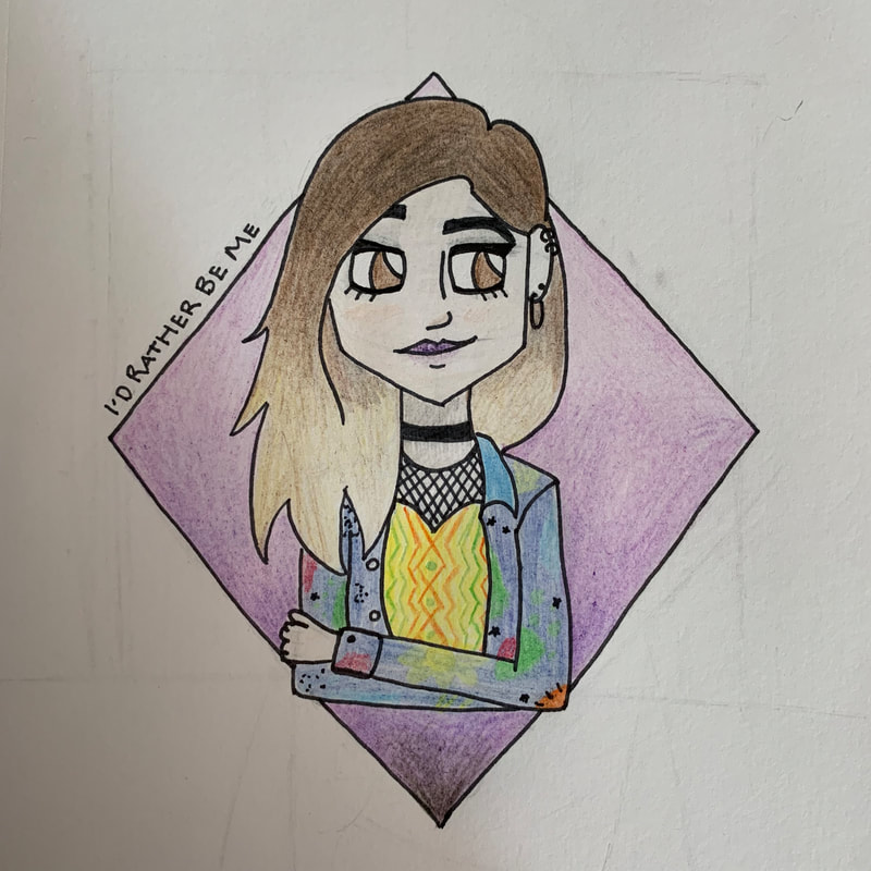
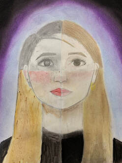
19. Pick two pieces that show how you have grown as an artist. Compare and contrast how you’ve grown, how the projects are related, and what you thought of each. These are both self portraits, created roughly two years apart. I drew the piece on the right in seventh grade, and the piece on the right in this class. I think I've definitely refined my ability to shade, and my understanding of facial proportions, as well as symmetry. I've also developed a personal style of art- I was going for realistic in seventh grade, whereas now I prefer a cartoony sort of style, with sharper edges around certain features, especially hair and jawlines, and larger than average eyes. I remember not being very pleased with my portrait in seventh grade, but I really like how my portrait turned out this year.
come by, such as drawing characters with unproportionally large eyes or with sharp, geometric lines. However, some have a more unique style. For instance, Picasso's artistic style was to draw faces all over the place- that was his trademark, so to speak. You can see my artistic style in the pieces above. I like to draw characters geometrically, with sharp edges. I draw eyes really large, eyebrows really defined, and usually only define the top lip. I use very stylised shapes in the hair- sharp points, swirls, the like.
1. I have completed the entire project since my in-progress piece. First, I made the lid by forming it to fit into the mouth of the jar. I made a decoration for the top of the lid as well. Next, I put it in the kiln to be fired. Once it was bisqueware, I glazed it and then put it back into the kiln. Once it was done in the kiln, it was finished.
2. I think I did a good job making the jar structurally sound. It’s pretty thick and heavy, so I’m not worried about it being too fragile. 3. Next time, I want to make the lid fit a little easier. It only fits if you put it in a certain way, which isn’t ideal.
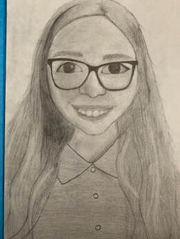
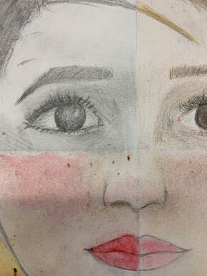
1. I did a portrait of myself.
2. I used pencil, colored pencil, chalk pastels, and watercolor paint. 3. First, I sketched out the entire face with pencil. I added value to the entire thing with pencil, then divided it into four sections. I erased everything except for the pencil quadrant. Then, I worked clockwise, filling in the face with colored pencil, chalk pastel, and then watercolor. Finally, I made the background with chalk pastel. 4. I think I did a good job making the different quadrants blend together. Next time, I want to try to make the nose look more realistic, and make the skin look more realistic.
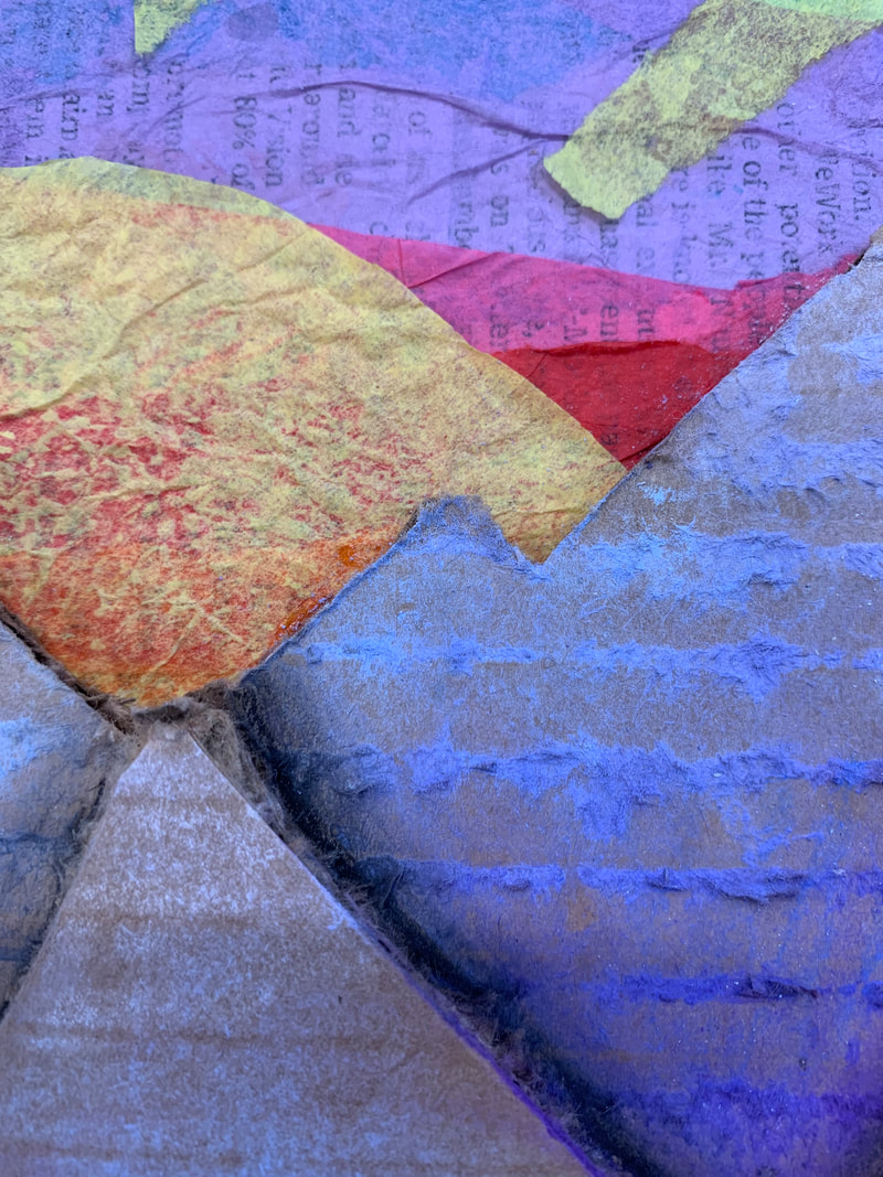
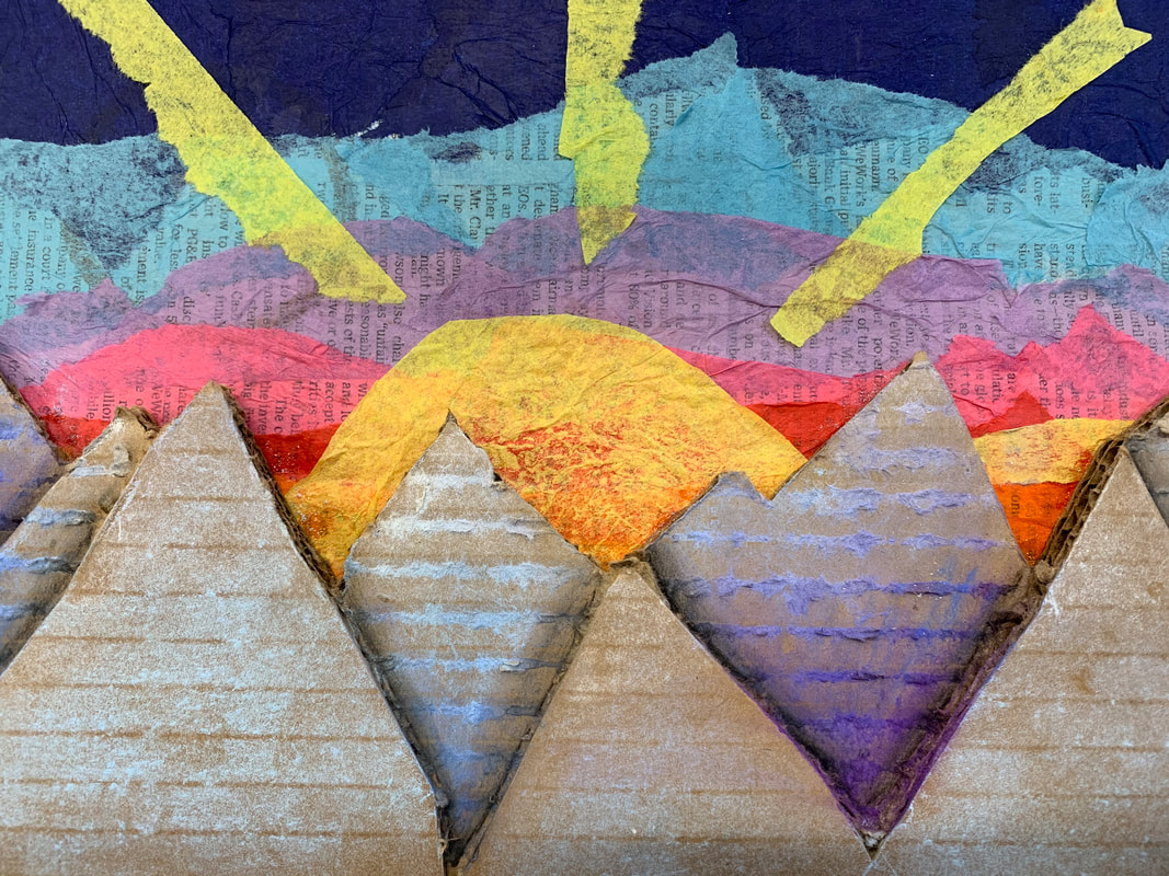
1. I used five mediums in this piece. First, I cut newspaper into pieces and glued it down flat against the cardboard. I let that dry, then put strips of tissue paper I had ripped on top of that. I started with orange, then worked my way up through red, pink, purple, and blue. I made the sun out of tissue paper as well and put that on top. Then, I carved mountains out of really thick cardboard. Finally, I used chalk pastels and charcoal pencil to add color and dimension to the mountains, then glued that on top of my sunset. Essentially, lots of glue was used.
2. My words were sunset and bliss. The sunset is pretty obviously portrayed, but I based bliss off of one of my favorite places, a cabin that my family and I stay at near the Blue Ridge Mountains. The mountains were made to look similar to the view from the Blue Ridge Parkway. 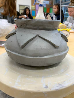 1. Once I finish this piece, I want to give it to my dad for Christmas, because it's based on pottery from his favorite video game. To finish it, it needs to be fired, then I need to add glaze. I think I will make the majority of it terra cotta colored, but the decorations will be navy blue and white. I'm not sure what color I'm going to paint the lid- maybe light brown.
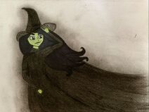
2. So far, I've found that keeping the piece a uniform shape has been really tricky. Some parts on the piece seemed to want to stick out more than other parts, so it looked a little bit off. 3. I think I did a pretty good job with solidly constructing the piece. I don't think it'll be excessively fragile after it's fired, because I solidly attached the decorations and made the piece itself pretty thick. 4. The first thing I did while I made this piece was run a piece of clay through the slab roller. I cut a roughly 3" circle from the slab and used that as my base. Next, I used the coil method, so I made a coil from clay, scored and slipped it and the surface I attached it to, and then smoothed it together. I did that to make the pot's form. It was still a little bumpy, so I used a rib and a metal scraper to smooth it out. Then, I made the bottom decoration by just rolling a coil out and flattening it out, then scoring and slipping the coil and the surface I needed to attach it to. I made the upper decoration by cutting uniform triangles out of a slab, then just attaching them to the pot by scoring and slipping. 1. My piece shows the theme of "line" because of the stylised way that it presents a well-known image. From the original scene in the movie "The Nightmare Before Christmas", I added lines in the sky and to the ground to add depth and a more interesting composition.
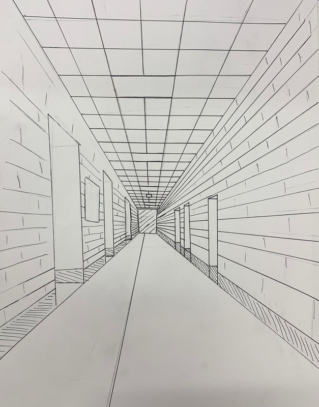
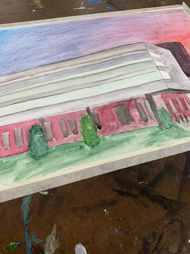
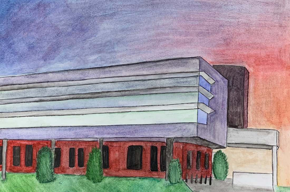
2. I think my piece was successful in the way I changed a scene and added to it to make it more interesting as a print. If I were to do it again, I think I would change a couple things. First, I would find a way to make the figure on the hill more detailed and rendered a bit better, because it was really hard to make the thin lines. Additionally, I think I would pick a less detailed scene, so I could represent it a bit better. 1. I used 2 point perspective in this photo- the two corners of the school are the two points where the lines converge, even if one isn't technically in the photo.
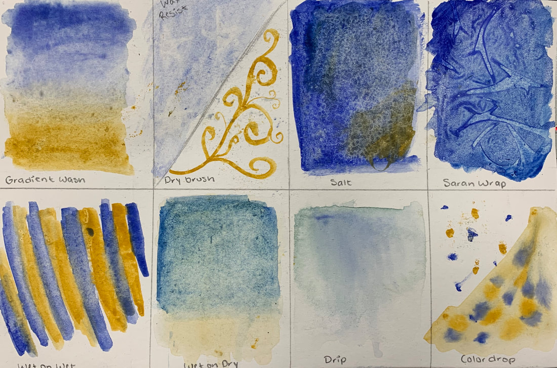
2. I took this photo in front of the school after a football game- the sky looked really pretty, so I took a picture. 3. It was really hard to get the sky to look reasonable, mostly because I find it really hard to create gradients with watercolors. 4. The watercolor techniques were helpful because they helped me figure out different techniques to get different looks in my piece. The hallway was really fun to make and helped me figure out orthogonal lines. 1. The watercolor technique page was helpful warm up, because it helped me learn a lot of different kinds of techniques that turned out to be really helpful in creating my piece.
2. I like how watercolors aren't too messy, because I tend to make a mess when I paint. Additionally, I like how watercolors can have varying levels of opacity, which makes them really easy to work with. 3. Watercolors are difficult to work with because I tend to use too much water or scrub too hard, and it makes the paper pill. I also find blending colors and creating gradients with watercolors really hard. 1. These activities helped me learn a lot about painting; I hadn't done much of it before this project. I learned that paints are pretty easy to blend if you have a wet brush, that you can make textures in a lot of ways, and that there are certain ways to make colors more muted, darker, or warmer/cooler. 2. I think the tint, shade and tone exercise will be most useful for my painting. My reference photo has a lot of blues in varying shades, so knowing how to get to specific blues using black and white is useful. 3. I learned the most from the color matching exercise, because it helped me start viewing colors as just a bunch of primary mixed together. I figured out how to make colors more or less saturated, darker, and lighter. 4. Brown is generally made by a combinations of the three primary colors (red, blue, and yellow). Usually the best way to get to brown is to take a secondary color (orange, purple or green) and mix it with its complementary color, which is a primary color. This will result in a brownish shade, then add colors you need to make it the correct hue. 5. To tone down a color, you generally just have to add the color's complementary color, which is the color across from your color on the color wheel. 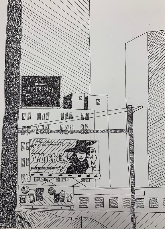   Above, left to right: Pen drawing, charcoal drawing, and pencil drawing. 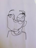 I think the most helpful warmup for me was the blind contour face. It really helped me start viewing complex images such as faces as just shapes that are all mashed together. It was pretty challenging, and the outcome isn't exactly great to look at, but it was fun and it really helped me later in the unit. Definitions:
The Pros and Cons:
Pencil Pros:
Pros:
Pros:
The artist that I chose to talk about is named Maja Wrońska. She lives and works in Warsaw, Poland as an architect and freelance illustrator. She has a Master’s degree in Architecture from the Warsaw University of Technology, and she is best known for her colorful watercolor paintings of European architecture. She started out by selling her artwork on sites such as Society6, but has grown a large following, including over 25,000 followers on Instagram. Her work is featured on her website, http://majawronska.com/ .
Maja Wrońska’s art is inspiring to me because of her amazing attention to detail and ability to capture a piece of complex architecture with watercolor paints, which I personally find extremely hard to work with. Her use of color is also extremely impressive- she uses lots of bright colors and varying shades, which adds a great deal of depth to her art. Overall, I greatly appreciate and am inspired by her immense attention to detail and ability to manipulate colors. Additionally, it’s interesting to me that she paints architecture and is an architect as well- it makes me wonder if she is able to portray the tiny details in well-known structures so well because she understands how it is put together. This principle could also be applied to someone who studied human anatomy and is therefore very good at painting or otherwise portraying people- understanding the science and structure behind something must make it easier to paint or draw. |