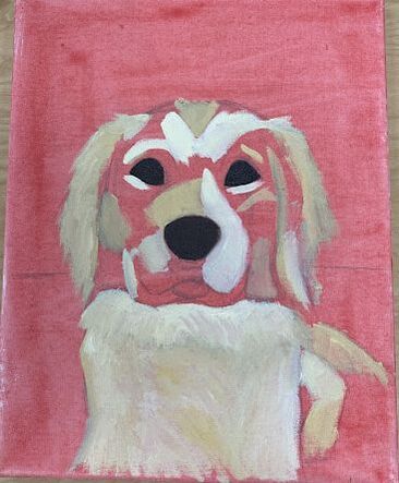
Color Sketch 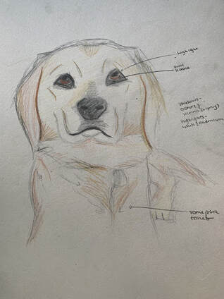 Progress Photos
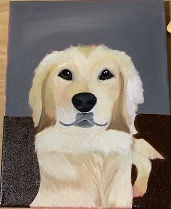
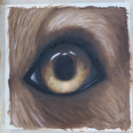
Final Painting 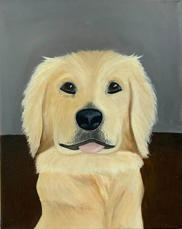 Self Evaluation Question Responses 1. I feel that this painting has very good craftsmanship. None of the underpainting is showing through, all lines are well places and precise, and all edges are clean.
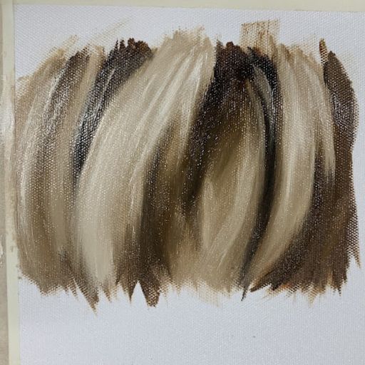
2. I think that lines are very emphasized in this piece because of the fur texture. I think that I utilized organic lines and shapes well throughout the painting to make it look realistic, as well as multiple values in the fur to add dimension. I think that the use of the values and lines in the fur adds dimension to the piece. I think that my use of color could have been more advanced- the grey and brown background is kind of boring. 3. The subject of this painting is my dog, Bodhi. Bodhi is a Sanskrit word that means "enlightenment," which my family says is ironic because Bodhi is not a particularly intelligent dog. He is adorable and goofy, but doesn't seem to have many thoughts in his head. I tried to communicate this in my painting: he looks sweet and happy, but there really is no thought happening behind his eyes. 4. I think that the focal point of this painting is Bodhi's eyes. As I mentioned previously, I wanted to make him look sweet, but not very smart. I accomplished this by keeping the eyes soft and simplistic: they are brown, with some yellow ochre for highlight on the iris and white for highlight on the eye overall. The collaboration of the contrast against his light fur and the lines that seem to wrap around the eyes draw the viewer's line of vision straight to them. 5. I used texture throughout the fur to make the painting more realistic. The goal of this was to capture the wispy, fluffy nature of his fur. I also used a little bit of stippling on the nose to add texture there. 6. Working through the eye and fur tutorials were a very good start to this painting. I ended up using several skills I picked up from the tutorials, such as adding ochre to a brown eye and mapping out fur sections with a large brush. These helped this painting be successful by providing me with techniques I had not used previously. I think that I was successful in this painting; although I think that more interest and texture could have been added to the background, I am happy with the subject of this painting and I think it accomplishes the tone I wanted to convey. 7. I did not enjoy using oil paint. Generally, I like to work fast, work in layers, and work with paint with a lot of movement. Additionally, I am a very messy painter, and tend to get my paint everywhere. None of these qualities are especially conducive to oil paint, so I struggled this unit. However, I did enjoy the outcome of my paintings. 8. The most difficulty I had with this painting was my inability to work in layers because the paint took so long to dry. I would end up smudging paint between two places that were not supposed to combine or completely losing my highlight colors in the darker colors beneath it. If I were to make changes to this painting, I would add more texture to the background.
0 Comments
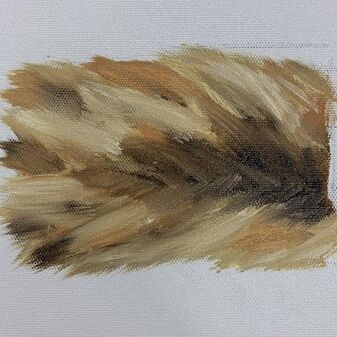
Fur Practice
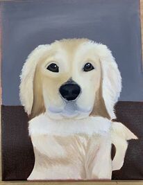
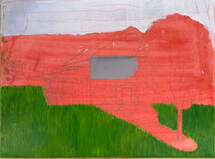
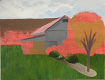
Color Sketch 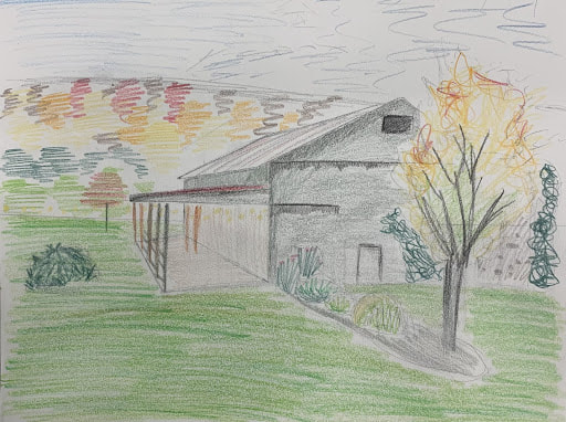 Progress Photos
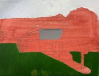
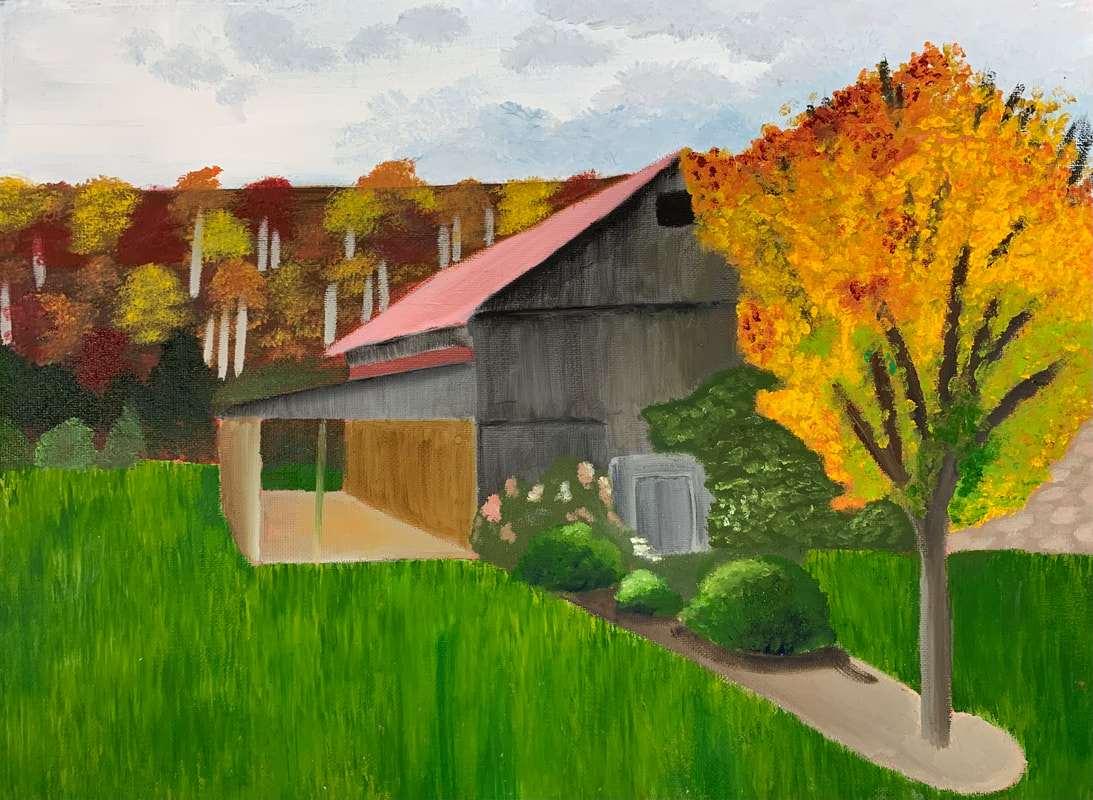
Final Painting 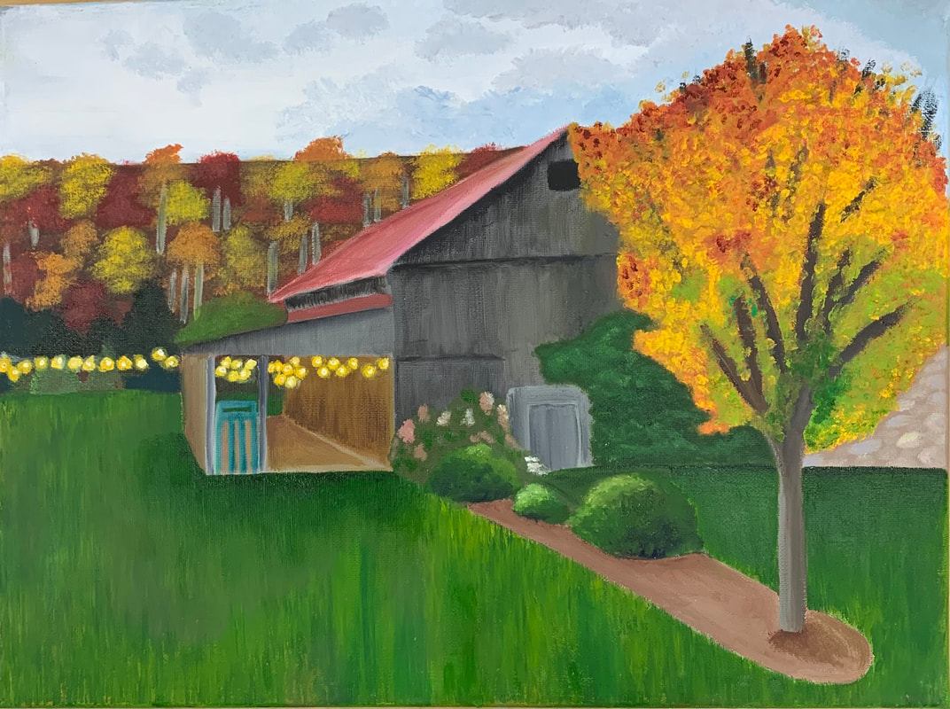 Reflection Questions 1. I think that this painting has adequate craftsmanship. I feel that most of it is neat and well-executed, although there are some areas that look a little messy around the edges due to the order of layer application.
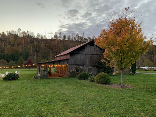
2. In this painting, I chose to use primarily bright, warm tones in order to communicate the cozy, autumnal atmosphere of the photo. Even the greens and greys I used were composed of warmer hues. The colors I used are also brighter than that of my reference in order to make the painting feel more cheerful. 3. I created contrast in this painting by using more muted colors in the trees in the background of the painting and brighter colors in the tree and bushes of the foreground, so the tree at the front catches the viewer's attention more than those in the back. I also used bright yellows in the lights to stand out against the dark green of the trees in the back. 4. I used texture in several aspects of this painting. The different textures in the grass, the leaves of the tree in the foreground, the leaves of the trees in the background, the leaves of the bushes, the climbing plants on the barn, and the wood of the barn walls all make the painting more interesting and give the viewer more to look at than simply flat colors. I used shadows and highlights to add depth to the painting, particularly to the barn and to the trees. I also added a shadow on the grass at the base of the barn to add realism and make the barn appear more solid and grounded. 5. I used perspective as well as shadows and highlights to add depth to the painting. The two point perspective of the barn creates the illusion of a three dimensional object. I also used highlights and shadows, which I discussed in the previous paragraph. 6. I think that one of the techniques that made this painting successful was my utilization of a fur-like texture in the grass, which we had learned about in the accompanying animal portrait unit. I also think that stippling on the leaves of the trees in the back created an interesting leafy effect that mimics the larger leaves of the bushes and the tree in the foreground. 7. The primary struggle I had with this painting was the two point perspective of the barn, because I have not used that skill in a while. The balance of the painting also feels off to me, almost as if the grass is too green and expansive. Were I to redo this painting, I would significantly mute the color of the grass. 8. I think that the most successful aspect of this painting was the communication of the overall mood I wanted to convey. The photo was taking at a wedding I recently attended, so I wanted it to have a warm, bright, and happy feeling to it, which I think was well communicated. I also think I did a good job painting in the texture of the barn's walls. |
AuthorLayla Ballinger Archives
January 2022
Categories |

 RSS Feed
