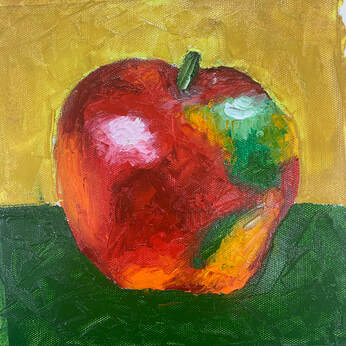
 This assignment was a pallet knife painting in which we followed a demo. I did not particularly enjoy this assignment, because I have a certain aversion to painting apples, and I do not like the lack of control you get as a result of painting with the pallet knife instead of a brush.
0 Comments
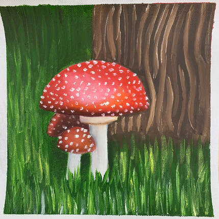 This assignment was a small oil painting in order to acquaint ourselves with using oil paints: how they mix, their relative transparencies, how much paint to use where. I enjoyed this assignment. I ended up painting a few small mushrooms, and also included grass and the base of a tree in the painting, which I think gives it a whimsical feeling.
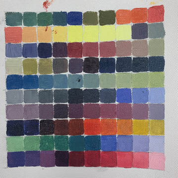 For this assignment, we were instructed to mix one hundred different colors using only red, yellow, blue, black, and white. I found this assignment pretty easy, as most of the colors I mixed were a base color's different tones, which I made by adding black or white. However, I also found that oil paint is very messy and takes a long time to dry, hence the red and blue smears on the canvas.
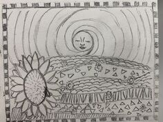
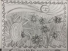
Compositional Sketches 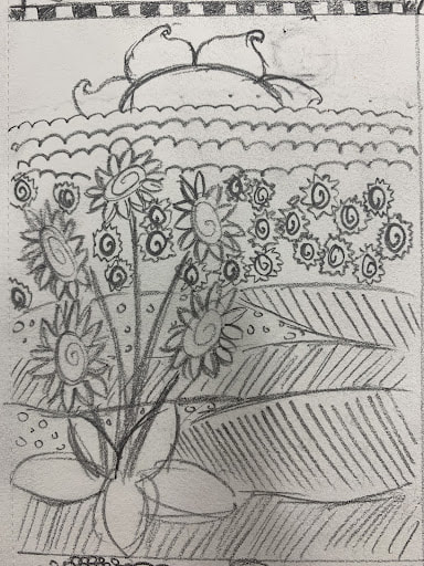 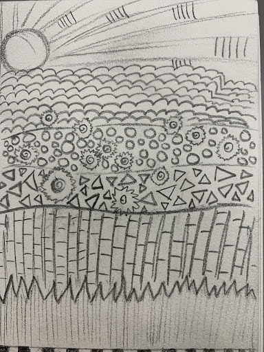 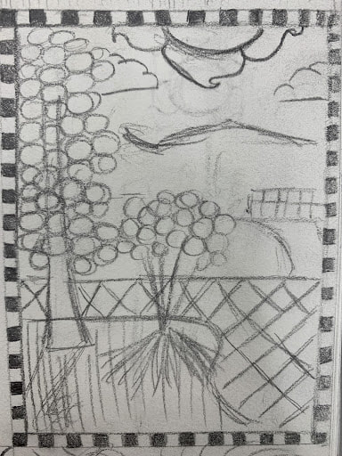 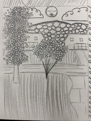 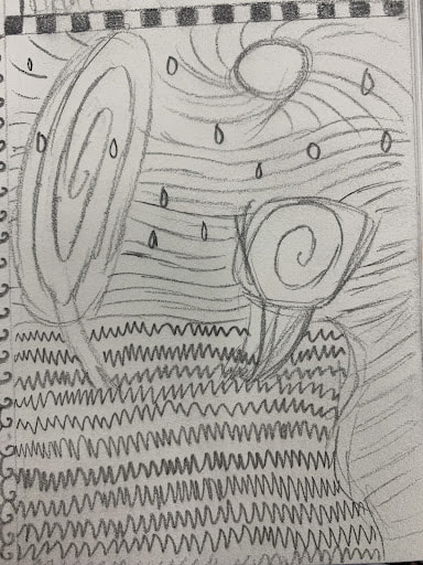 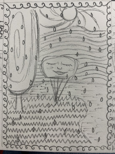
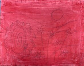
Final Color Sketch 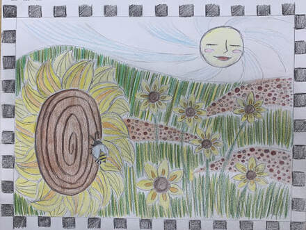 Progress Photos
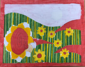
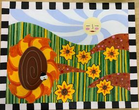
Final Painting 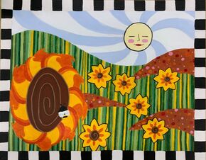 1. I think that this painting is well executed. The majority of my lines are neat and clean, shapes are well defined, and most of the paint is applied uniformly enough to not show brushstrokes, with the exception of a few small sections.
2. My piece embodies the style of Hundertwasser by utilizing bright colors, a child-like drawing style, and a very flat, unrealistic perspective. 3. I chose to mainly use shades of analogous colors (particularly orange, yellow, and green) in order to maintain a consistent and simplistic feel within the painting despite the amount of patterns and shapes involved. 4. The focal point of this painting is primarily the large sunflower in the foreground. The sun may also be considered a focal point. 5. The most prominent patterning in this painting can be found in the grass, which I composed with horizontal stripes in various tones of green and yellow. A dot pattern can be found in the brown areas, which is meant to represent dirt and rocks and serves to break up the continuous lines of grass in the painting. 6. The border on the painting adds interest. According to feedback I received, it seems to make the painting feel as though the viewer is looking at it through a window or a television screen. I think the black and soft white emphasizes the brightness of the rest of the paining. I included spirals in the center of the flowers, as well as a more subtle one in the sky behind the sun. These add a more "Hundertwasser" feel to the painting. 7. While creating this painting, I had a really hard time with making the colors- particularly the yellow and green- clearly translate over the red underpainting. In the future, I think I will use a less disruptive underpainting color. I also had a hard time ensuring the shapes of the flowers were well defined. I think I resolved this well with the black outline I used on the flowers. 8. Planning and revising the sketches were infinitely important to the success of this painting. Because of the very defined and precise craftsmanship required by the Hundertwasser/Klimt style, it was important that I knew exactly where each element and color belonged on the canvas. Once the sketch was done on the canvas, adding the color was relatively easily, with the exception of the aforementioned color struggles. I think that I was successful in communicating the feeling I wanted the painting to have: cozy, familiar, and childlike. 9. During the course of this unit, I learned that I need to consider the color of my underpainting before I start a project. Additionally, I found that my paintings tend to be significantly more successful if I create compositional and color sketches before I begin painting. |
AuthorLayla Ballinger Archives
January 2022
Categories |
 RSS Feed
