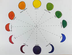
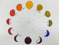
This assignment served as a warm-up before starting our acrylic paintings. We were to make two color wheels, using non-traditional shapes, using cool tones in one and warm in the other. I chose to use the phases of the moon as my shape.
0 Comments
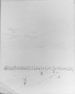
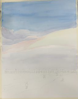
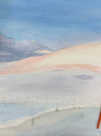
Compositional Sketches 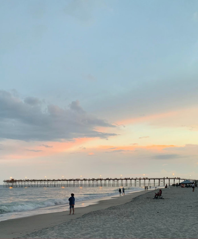 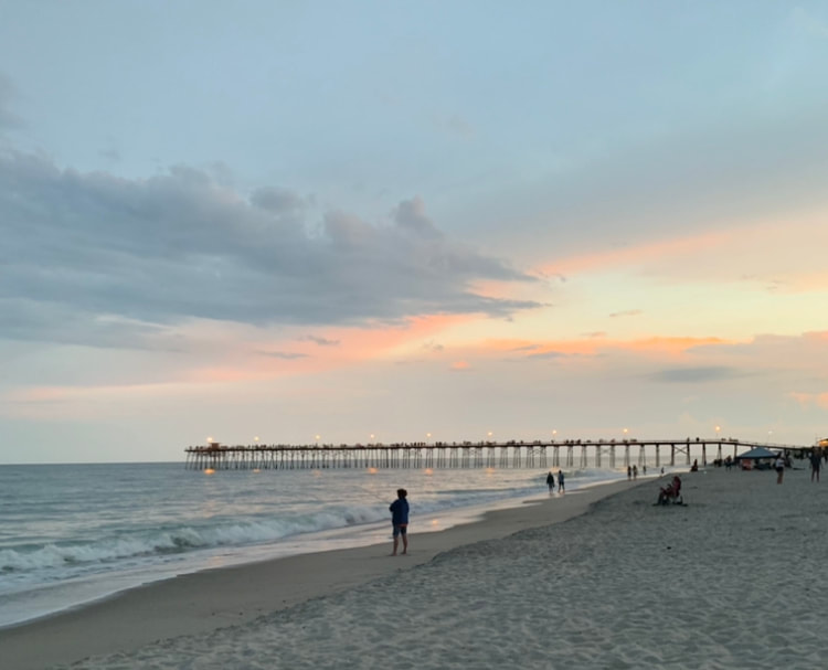 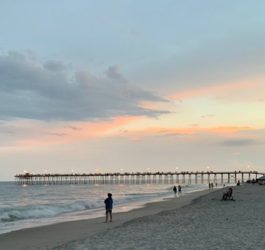 Progress Photos
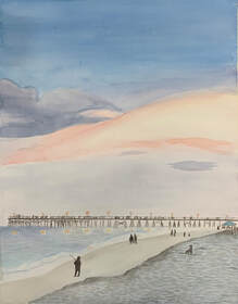
Final Painting 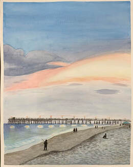 Watercolor Critique Reflection Questions
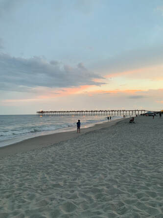
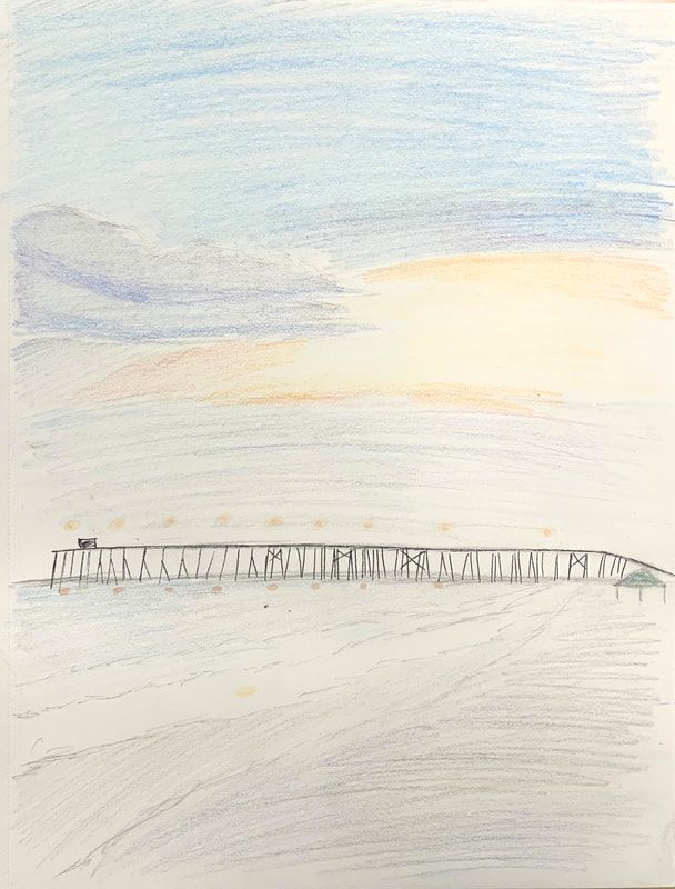
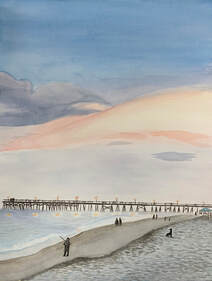
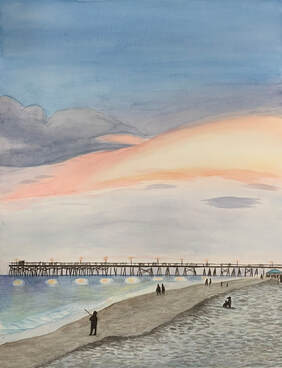
1. The most effective and useful watercolor technique used in this painting was layering. Using light layers of paint proved to be essential to building the values particularly in the sky and water, but through all of the painting as well. Additionally, the use of the gradient technique was helpful with the addition of value to the water, because it was lighter closer to the shoreline and darker closer to the horizon. Finally, the dry brush technique was effective in making the pier on the horizon of the painting, because it created darker, more defined lines than if more water had been used. 2. Using transparent layers was extremely important in my painting. There were a lot of different light sources in the painting which gave off different colored light. The use of transparent layers made it easier to differentiate the different light sources and their reflections. It also made it easier to create more complex colors throughout the painting; for example, I used several translucent layers of blue, brown, and grey to create the color in the sand. 3. I think that my composition was successful. The different colors and shapes in the sky created variety and movement in the painting, and the pier on the horizon created an interesting line separating the bottom third of the painting from the top two thirds. I used several elements of art: the lines of the pier and the sky, the shapes of the people and the clouds, the texture of the sand; and the value, space, and color throughout the whole painting. I think that my use of form could have been improved upon- the painting does not seem particularly 3-dimensional. Because I am not very familiar with the principles of design, I do not think they were utilized particularly well in this composition. However, I think that the scale and balance of the painting is well-executed. 4. Color choice was an important factor in this painting because it was important to making the painting realistic as well as interesting. For example, someone would generally use tan or brown to paint sand. However, because of the lighting in the reference photo, the sand appeared to be more blue and grey, with a little bit of brown as well. Thus, I used a light blue background to paint the sand, and layered small brushstrokes of blue-grey, grey, and brownish-grey. 5. I think that my craftsmanship is adequate. I was very careful to not overwork the paper, and used many transparent layers as directed. I especially like my attention to detail in the form of the pier and the sand. However, I feel that some things could have been improved upon, particularly in the water, as I found that area particularly challenging. 6. If I could do something differently, I would pay more attention to the shapes in the sky. I feel that the shapes I drew had too much curve to them, particularly in the cloud, but also in the yellow/orange/pink section. I would also pay more attention to the reflections of light in the water. I would use a resist method to leave it white, and then paint over it with pinkish-yellow, rather than trying to paint over the existing blue. 7. In this unit, I learned a lot about watercolor. Previously, I had not particularly enjoyed watercolor paints, as I found them difficult to use and would get frustrated when the water tore up my page. However, now that I have learned proper technique for using them- working in transparent layers, using enough water, not overworking the paper- I quite enjoy painting with them. I also learned that I am kind of impatient and not very good at waiting for layers to dry, and I should always use some kind of resist method if I want a space on my watercolor painting to be white, because I tend to forget where I want the white spaces to be. I think that these new lessons have greatly improved my development in art. Working with new mediums, or mediums I don't particularly think I enjoy, always proves helpful to my knowledge and technique in art.
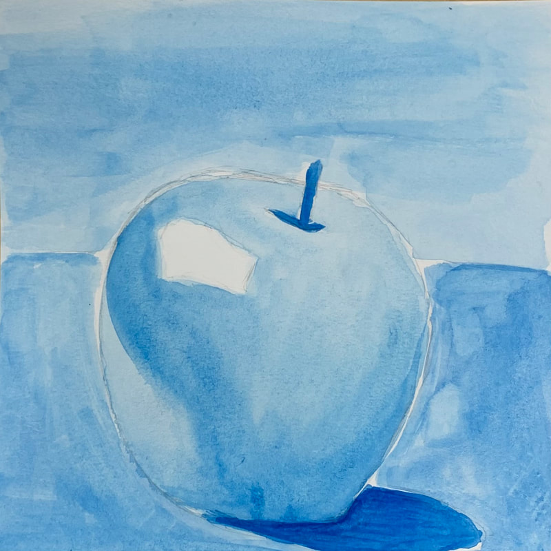
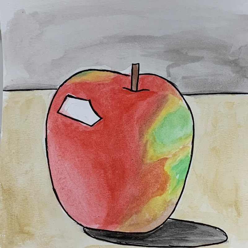
This assignment asked us to paint four versions of the same fruit in watercolor using four different color schemes. The color schemes I chose were cool tones, watercolor pencils, monochrome, and a choice of color scheme with pen and ink. I was not especially pleased with how my paintings turned out, but I think that I will improve as I have more opportunity to work with watercolors.
 For this assignment, we were directed to create a watercolor value chart, as well as three forms beneath it (specifically, a sphere, a cone, and a cylinder or cube). I think that the value chart went well. It took quite a long time to wait for the layers to dry, but the result was definitely a light-to-dark gradient. The forms were especially challenging for me, as I have not done a lot of work with 3D objects, but I like how my sphere turned out.
 This was an in-class assignment to go over different watercolor techniques. I think that I did fine with this assignment; it was almost exactly the same as one I remember doing in Art 1 as a freshman.
|
AuthorLayla Ballinger Archives
January 2022
Categories |


 RSS Feed
