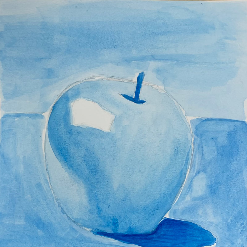
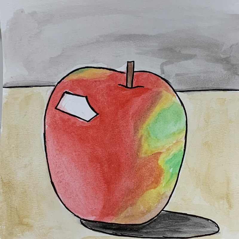
This assignment asked us to paint four versions of the same fruit in watercolor using four different color schemes. The color schemes I chose were cool tones, watercolor pencils, monochrome, and a choice of color scheme with pen and ink. I was not especially pleased with how my paintings turned out, but I think that I will improve as I have more opportunity to work with watercolors.
0 Comments
 For this assignment, we were directed to create a watercolor value chart, as well as three forms beneath it (specifically, a sphere, a cone, and a cylinder or cube). I think that the value chart went well. It took quite a long time to wait for the layers to dry, but the result was definitely a light-to-dark gradient. The forms were especially challenging for me, as I have not done a lot of work with 3D objects, but I like how my sphere turned out.
 This was an in-class assignment to go over different watercolor techniques. I think that I did fine with this assignment; it was almost exactly the same as one I remember doing in Art 1 as a freshman.
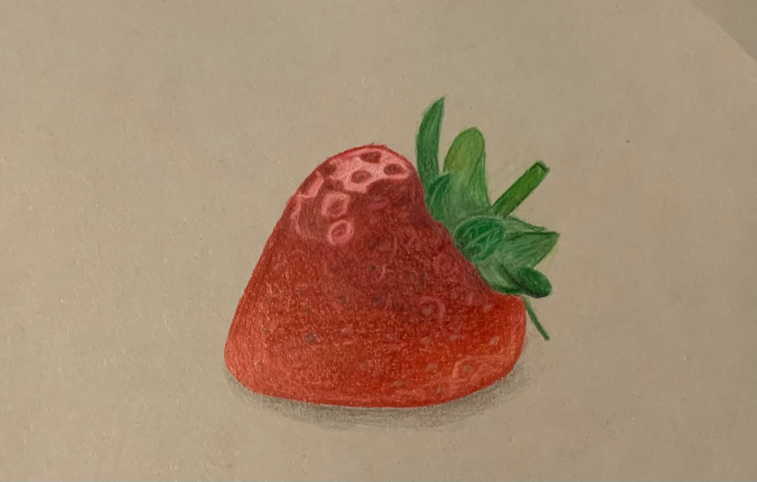 In this project, we were directed to draw a fruit or vegetable using Prismacolor colored pencils. I chose to draw a strawberry. This was one of the first few times I had worked with Prismacolors, so I found I experienced a bit of a learning curve, especially while working on the highlighted portions of the berry. Overall, I put in my best effort, but I am not entirely thrilled with the final outcome of this assignment.
This assignment was to draw six forms with Prismacolor colored pencils; a sphere and a cone in three different color schemes, on three different colors of paper. This assignment was challenging for me, because I do not have a lot of experience with colored pencils. However, I feel that I did pretty well with this assignment. I especially like how the cones turned out. I think my shading of the spheres could have been a little smoother, though.
This was an assignment to assess our understanding of certain aspects of art, particularly creativity, portraiture, perspective, and proportion. I was very pleased with how my portrait came out, and mostly pleased with the other three. I do not think that the foot is very realistic, so that was probably my weakest drawing in this assessment.
|
AuthorLayla Ballinger Archives
January 2022
Categories |


 RSS Feed
